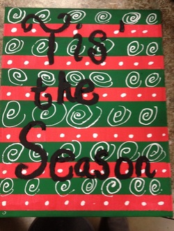
I had to pick another art challenge for art. Since it was so close to Christmas I wanted to paint a picture to hang in my room. I looked on Pinterest for some ideas and I came across end this one and liked it. So I got a canvas and painted two coats of red. After it dried I put painters tape on the canvas. I made sure it was in straight lines, pushed the tape down so there weren't any bubbles, then I put it on the edges of the canvas so it still looked good on the side. Then I painted it green. I had to wait till the next day to pull off the tape. After I pulled off the tape I got some white out and drew the polka dots and circles. I know the circles aren't the best but it was better than I thought. The white out dries really quickly so I could write the letters right after the white out. I got some black paint and a thin brush. I free handed "Tis the Season" on the canvas. It was really hard to get it perfect. And even then it didn't come out perfect but I tried and that's all I care about. I took it home that day and hung it on my all. I still have it up even though it's not Christmas. This challenge was one of my favorites.
We chose Squirt from Finding Nemo out of colored pins because its our favorite kids movie and its our favorite character. 1. First what we did was we looked on Pinterest and thought of our own ideas 2. Next after we found what we were doing we started to collect pins of all the colors we needed. 3. Third we printed out a picture of Squirt, turtle from Finding Nemo, and pinned it to the board with a clear pin. 4. Then we started putting the greens on the outline for his actual color 5. We didn't have enough green to go all the way around so we did a pattern. First it went yellow, green, yellow, green then it went, green, white, green, white. 6. After we got the reds and used that for his brown spots. So we put the red onto the circles of the brown. 7. When we had all the pins in place we started to take the paper out. It was difficult and took awhile to do. 8. Finally we took a picture of the finished project and used an app to find an affect. We chose neon and it looks colorful and has a bit of tie dye. Step 1: You have to make three idea sketches of some logos you would like to print. It must be 2.5*3.5. Then you have you have to make a final sketch which is going to be your logo. You can take ideas from your three sketches and combine them to make a logo or you can make a whole new sketch if you don`t like the ones you made. Step 2: The second step is to take your final sketch and put it on a piece of paper backwards so that it comes out the right direction ion your linoleum block. Step 3: Then you have to color the back of the piece of paper with a pencil. Then put it on the face down on the linoleum block so the colored back is facing you. you need to press really hard with your pencil on the back of your paper so it will come out on he linoleum block. You also can free hand it. Step 4: You might want to go over the pencil markings because it might not be very visible. Step 5: Get the right size Carving tool and then carve over the pencil markings to make your design. Whatever you cut out will be the white. Make sure your hand is behind the carving tool because you can cut yourself. Step 6: You get the color of ink you want out and put it on a metal sheet. Make sure that you don't get to much. Less is more when you use the ink You take the brayer and put it in the ink. You want to spread it out. You want to hear a sticky sound because that means you have enough. Put the brayed full of ink on your logo that's in the linoleum block. Make sure it is covered. Step 7: Take your print and put it on a big sheet of paper. You want to have 6 good prints before you go to the next step. Step 8: When your done cut all the prints out and you have to take pictures of the ones that turned out the way you wanted it to. Step 9: Right your name and the year on the the bottom or side of the sheet. After you fill out the rubric you turn it in. This is my logo design. I like bows so I decided to make that my logo design. I wanted the final print to look all faded and messy because it explains that nothing is perfect. I did the pink and green because I like the two colors together.
|